
Sforno Pizzeria Napoletana
Brand and visual identity exploration for Neopolitan Pizzeria in Hayes Valley, San Francisco
Project: August 2026 — September 2026
Role: Brand Designer
Scope: Strategy, Identity, Art Direction, Print, Digital & Environmental
Tools: Adobe Creative Cloud
PROJECT SCOPE + INFORMATION
Overview
A brand identity exploration for Sforno, a family-owned Neapolitan pizzeria in San Francisco’s Hayes Valley. Developed through firsthand experience working with the restaurant and conversations with the ownership team, the project explores how Sforno’s visual identity could better reflect its commitment to traditional Neapolitan pizza, Italian heritage, and warm neighborhood character.
The identity builds on the existing brand through a refreshed wordmark, typography, color, illustration, patterns, and applications across the restaurant experience..
Restaurant Concept
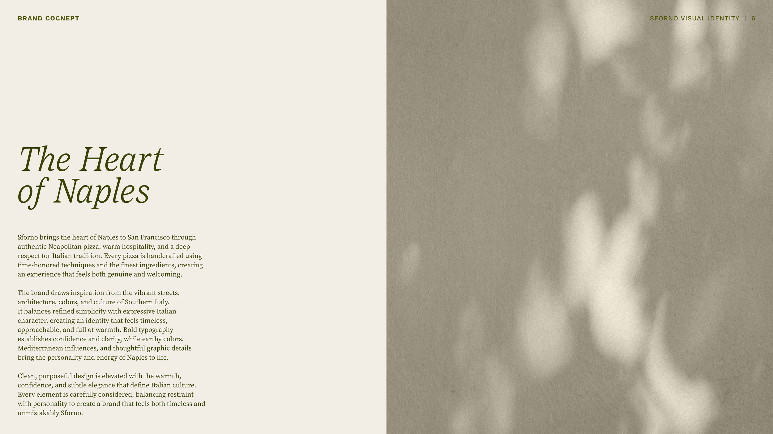
Sforno brings The Heart of Naples to San Francisco through authentic Neapolitan pizza, warm hospitality, and a deep respect for Italian tradition. Every pizza is handcrafted using time-honored techniques and the finest ingredients, creating an experience that feels both genuine and welcoming.
The brand draws inspiration from the vibrant streets, architecture, colors, and culture of Southern Italy. It balances refined simplicity with expressive Italian character, creating an identity that feels timeless, approachable, and full of warmth. Bold typography establishes confidence and clarity, while earthy colors, Mediterranean influences, and thoughtful graphic details bring the personality and energy of Naples to life.
Clean, purposeful design is elevated with the warmth, confidence, and subtle elegance that define Italian culture. Every element is carefully considered, balancing restraint with personality to create a brand that feels both timeless and unmistakably Sforno.
Role
Brand Designer;
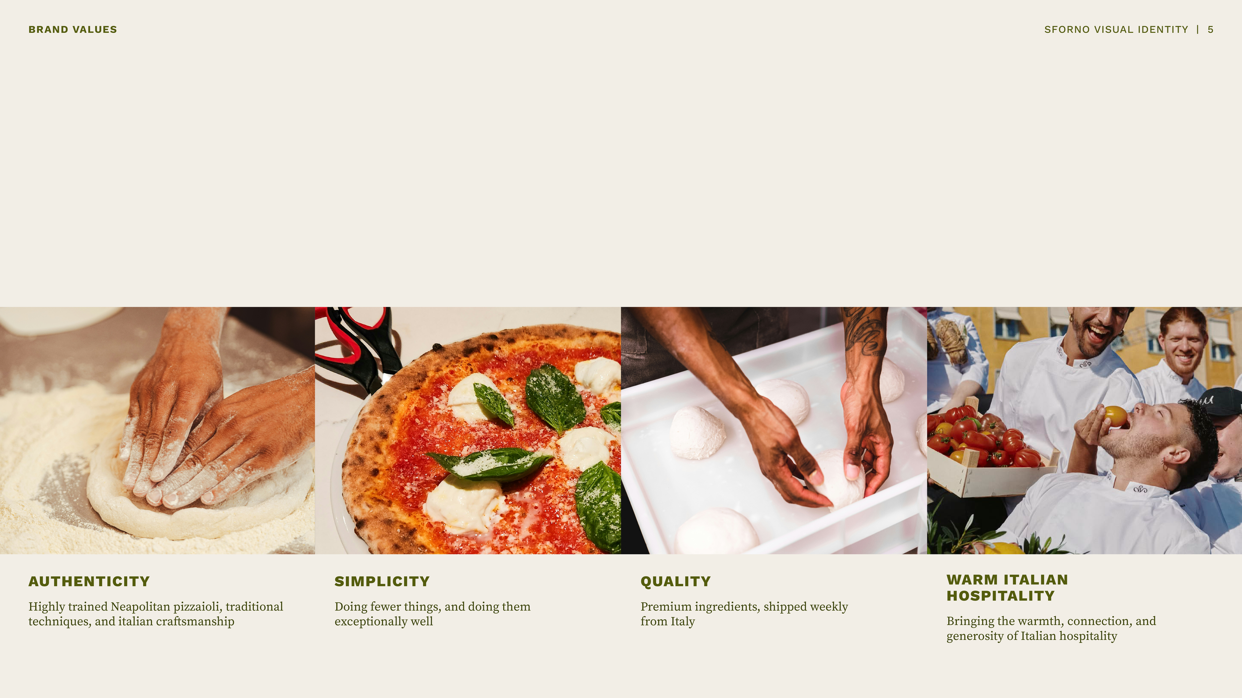
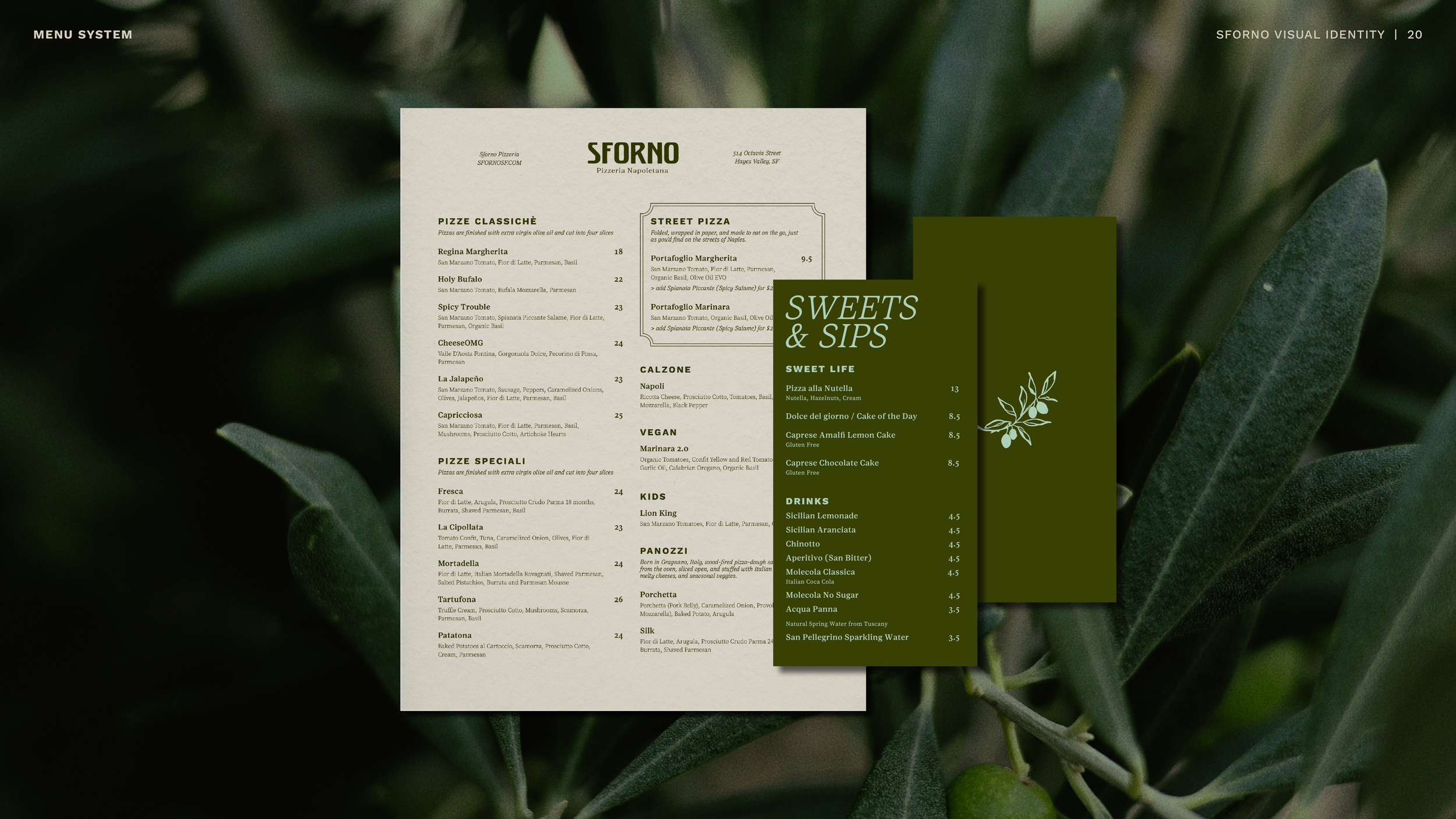
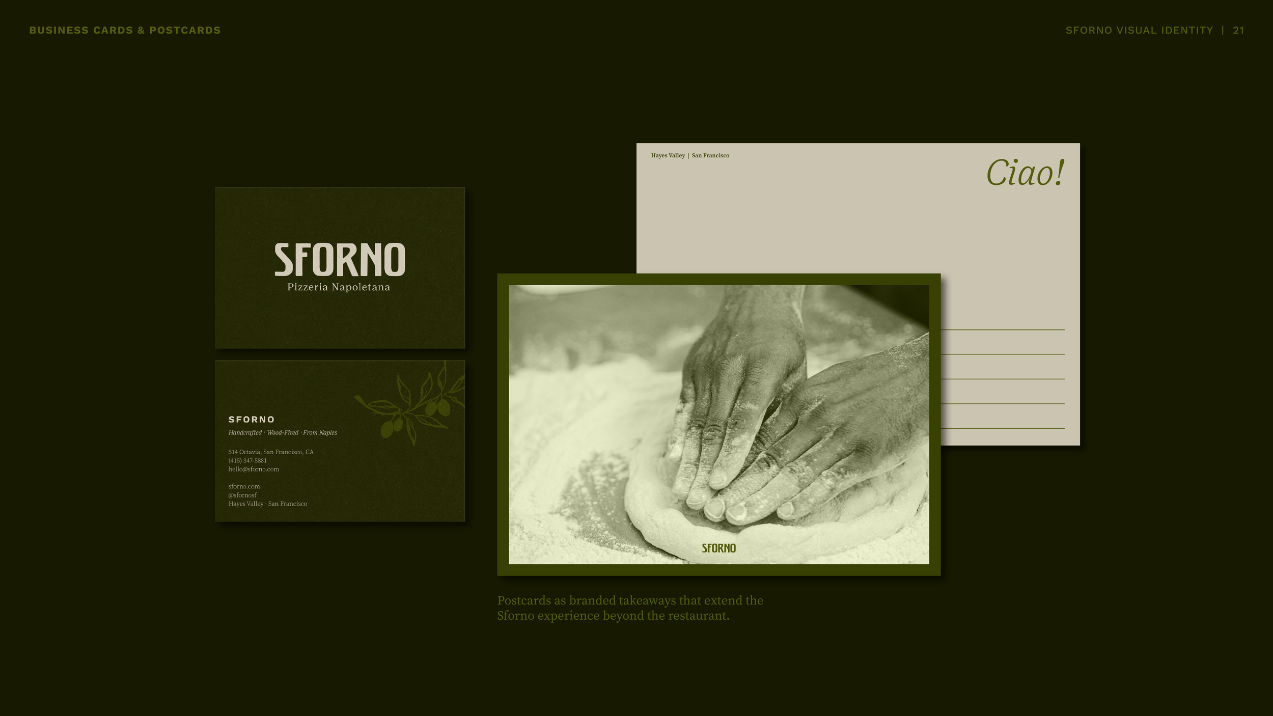
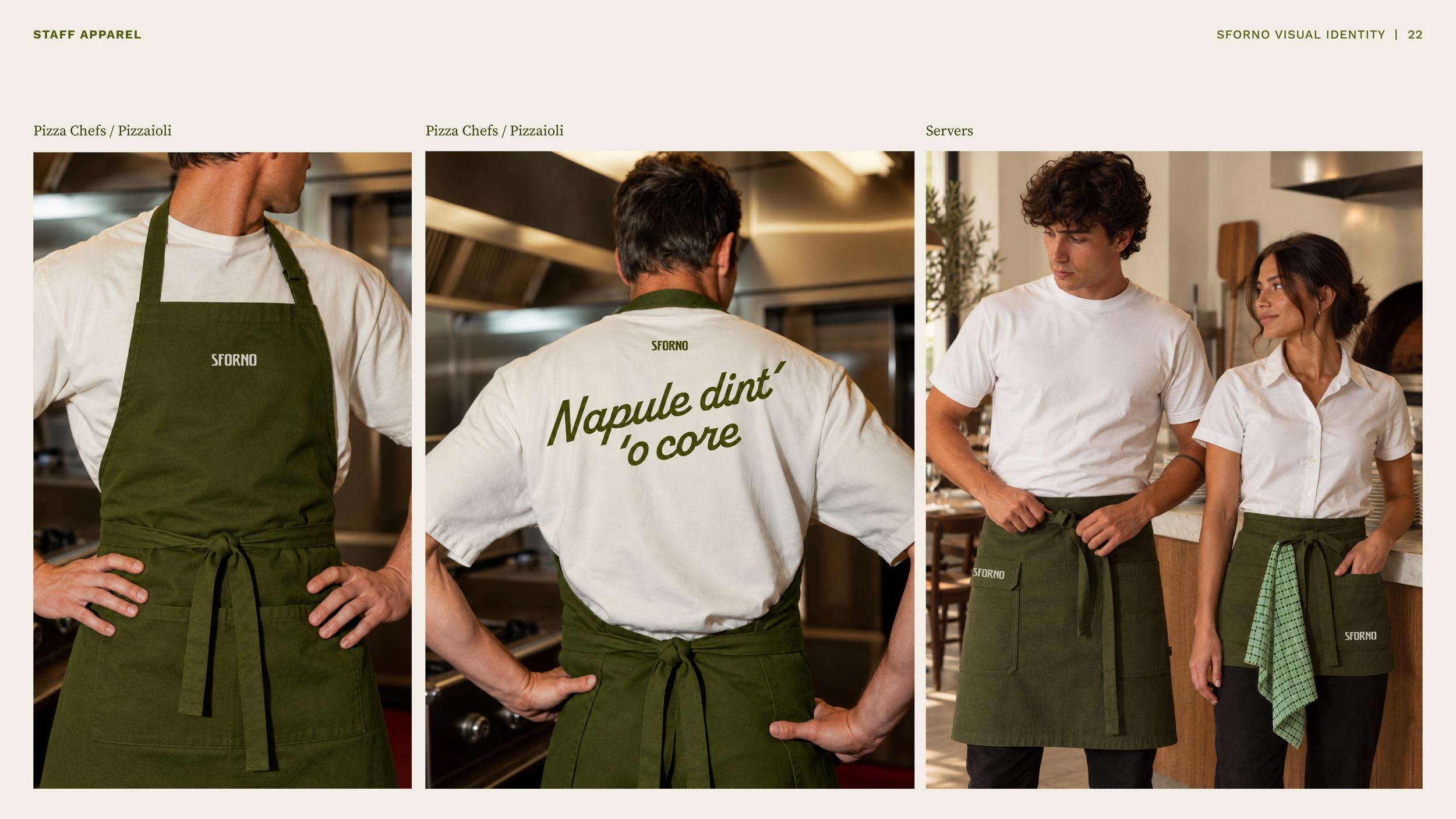
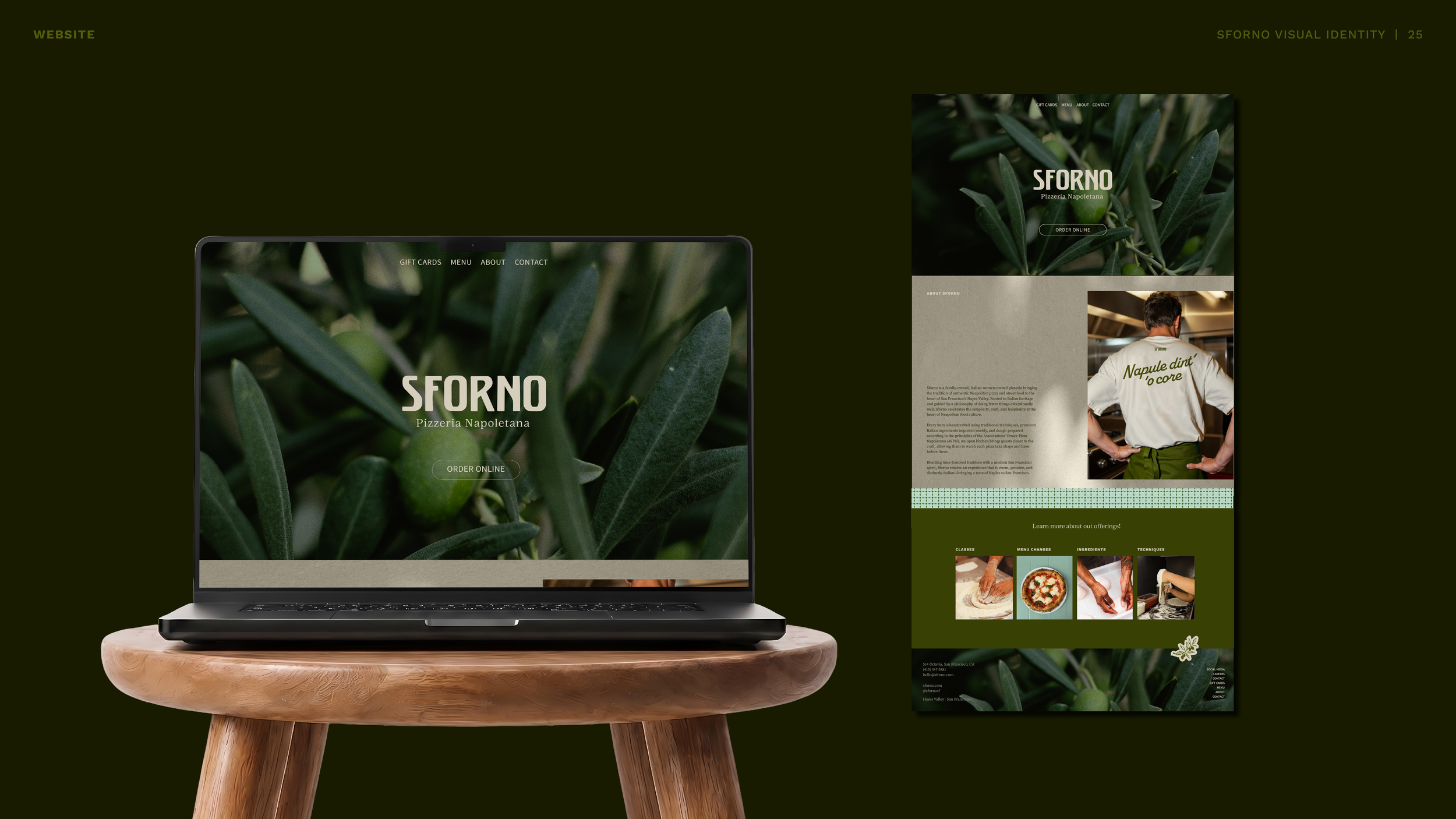
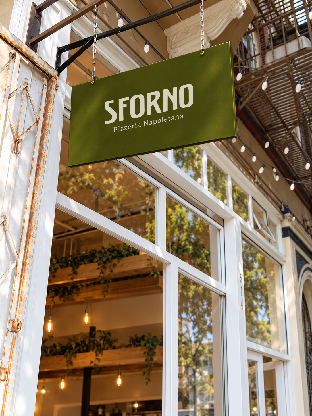
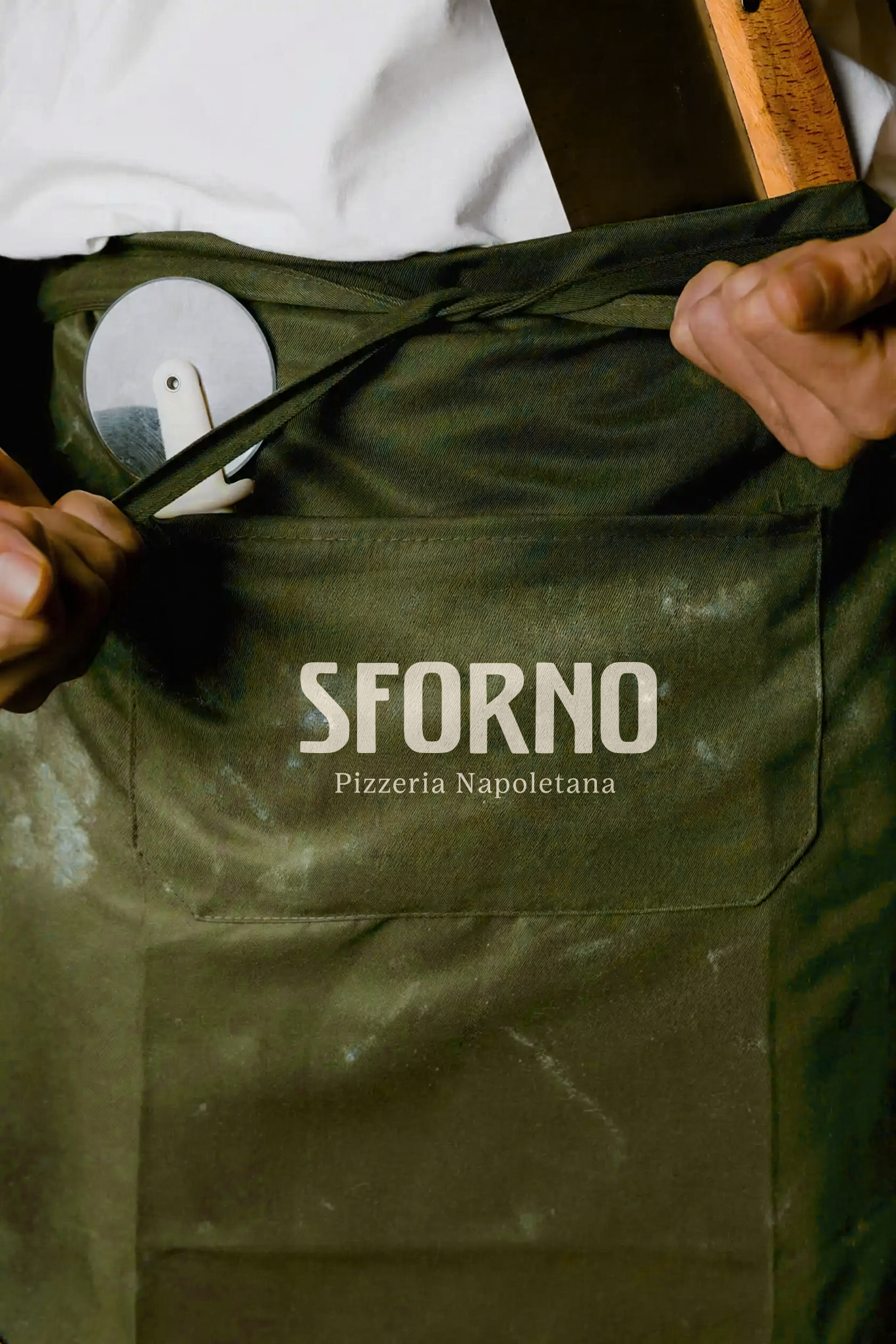
Led the creative exploration from strategy through visual development, including brand positioning, art direction, logo design, typography, color, illustration, patterns, signage, menus, social media, and collateral.
Independent concept developed in collaboration with and informed by the Sforno team. Final identity and applications shown are exploratory and have not been fully implemented.
Thinking + Design Approach
The identity is rooted in Sforno’s commitment to traditional Neapolitan pizza, balancing Italian heritage and craftsmanship with the warmth and energy of a modern neighborhood restaurant.
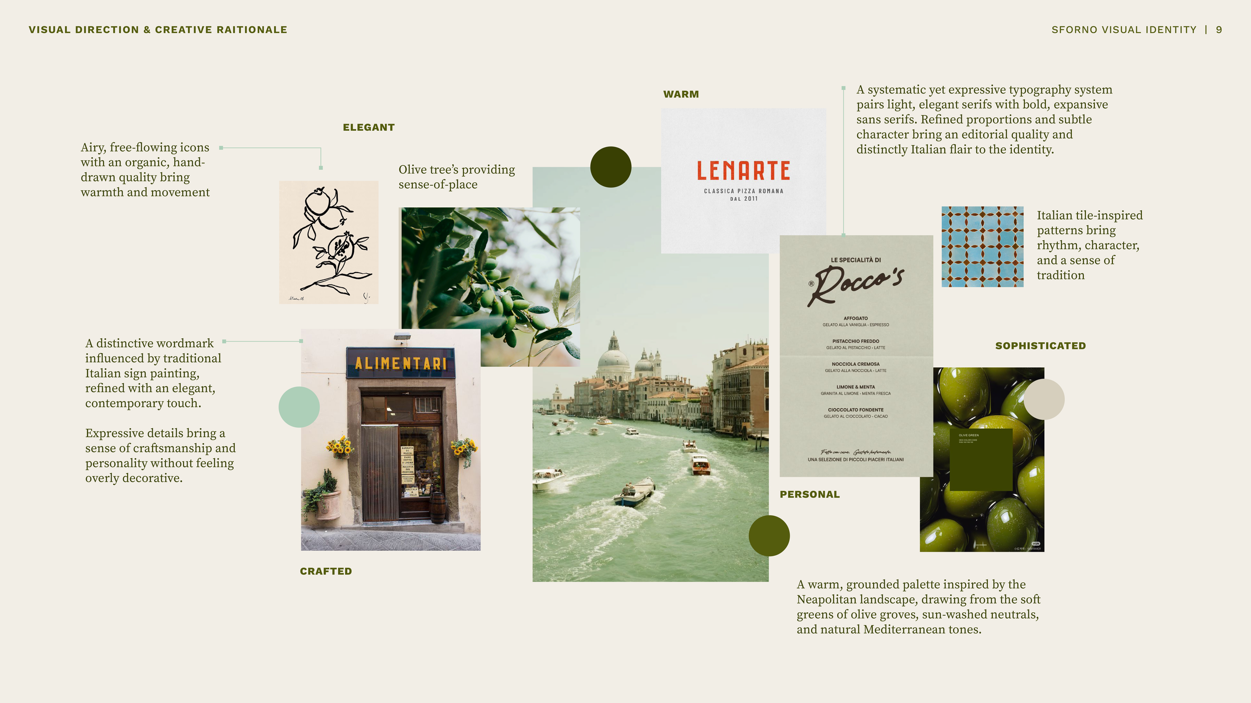
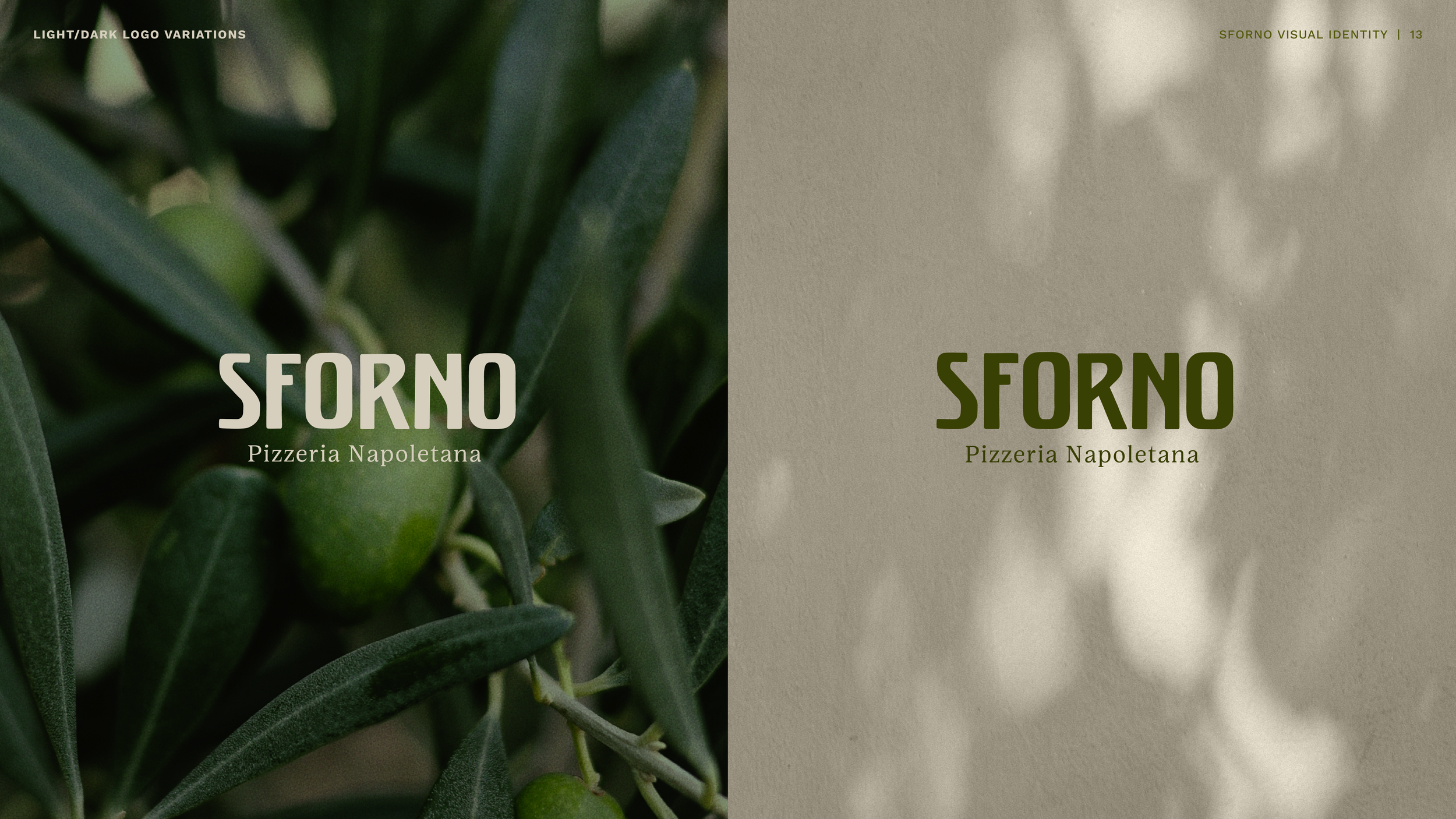
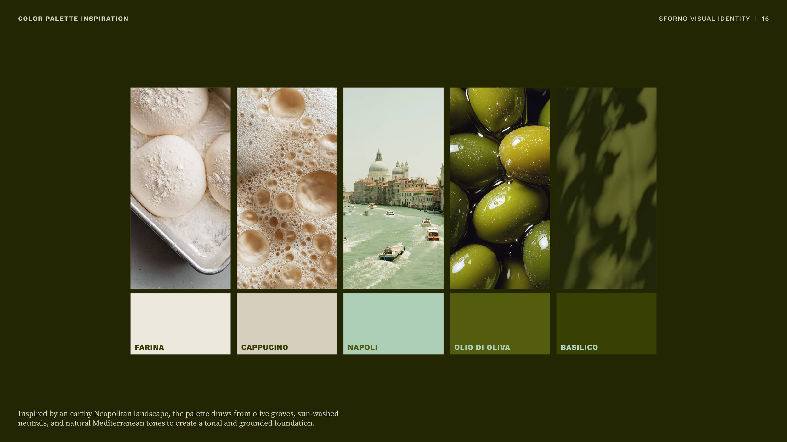
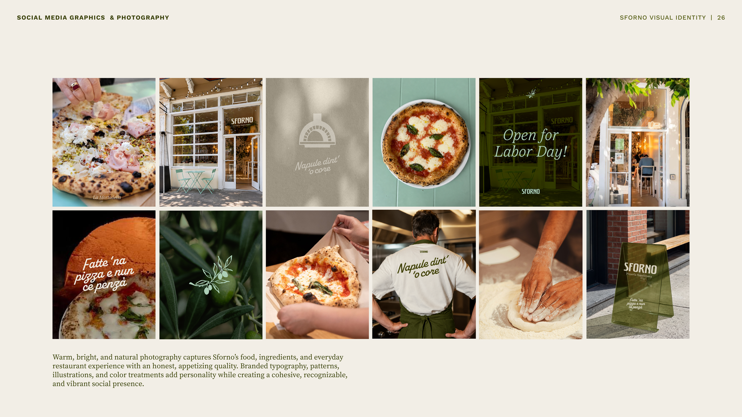
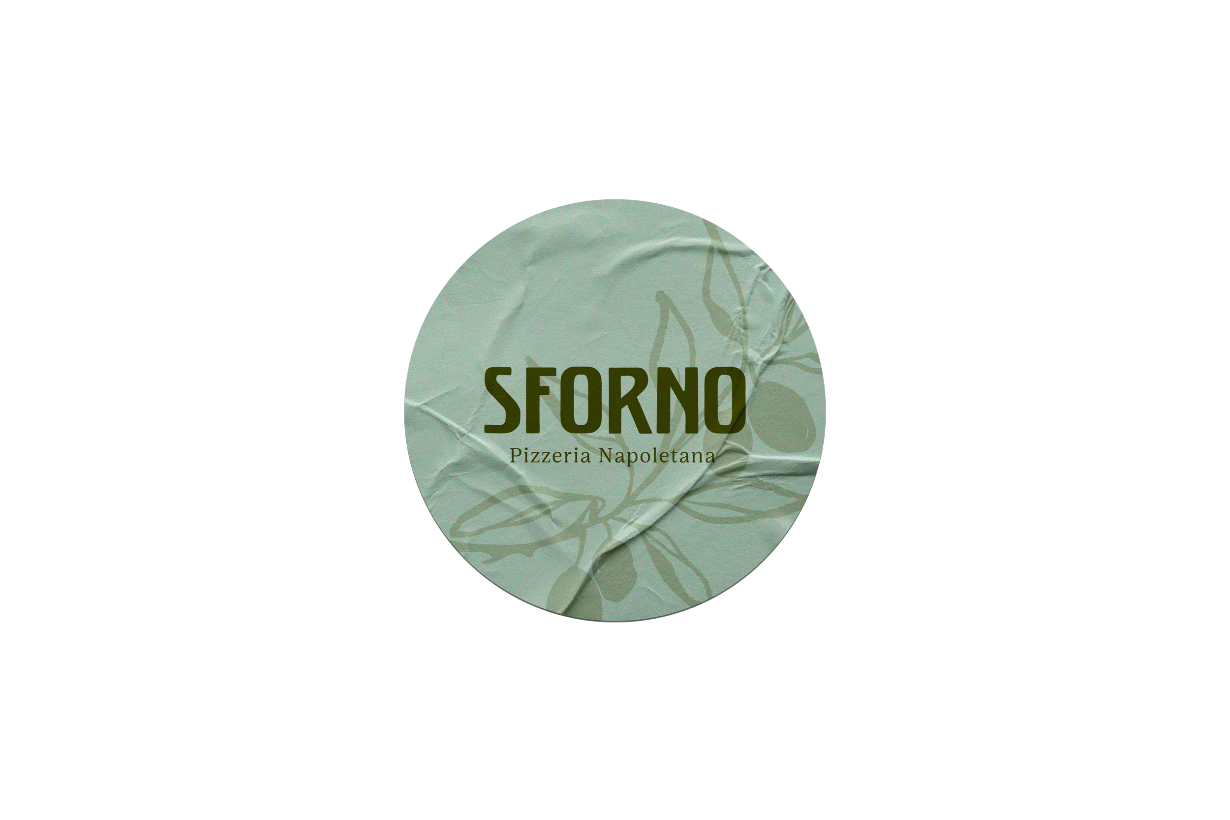
Rather than relying on the familiar reds often associated with pizzerias and Italian restaurants, Sforno draws from the lush, natural atmosphere of Naples—the greens of olive groves, sun-washed neutrals, and earthy Mediterranean tones. This more grounded palette creates a warm, inviting backdrop that allows the quality and simplicity of the food to shine.
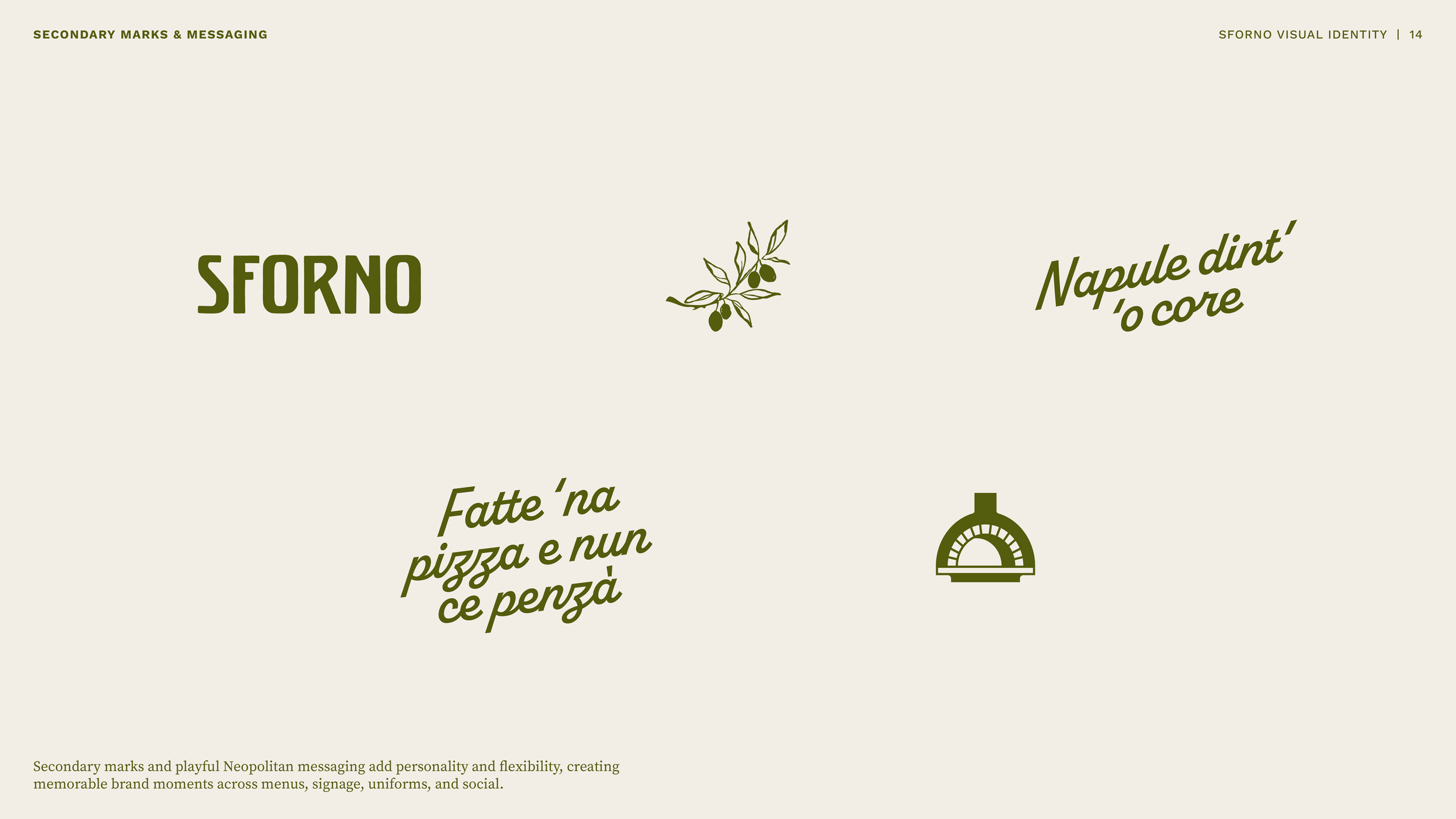
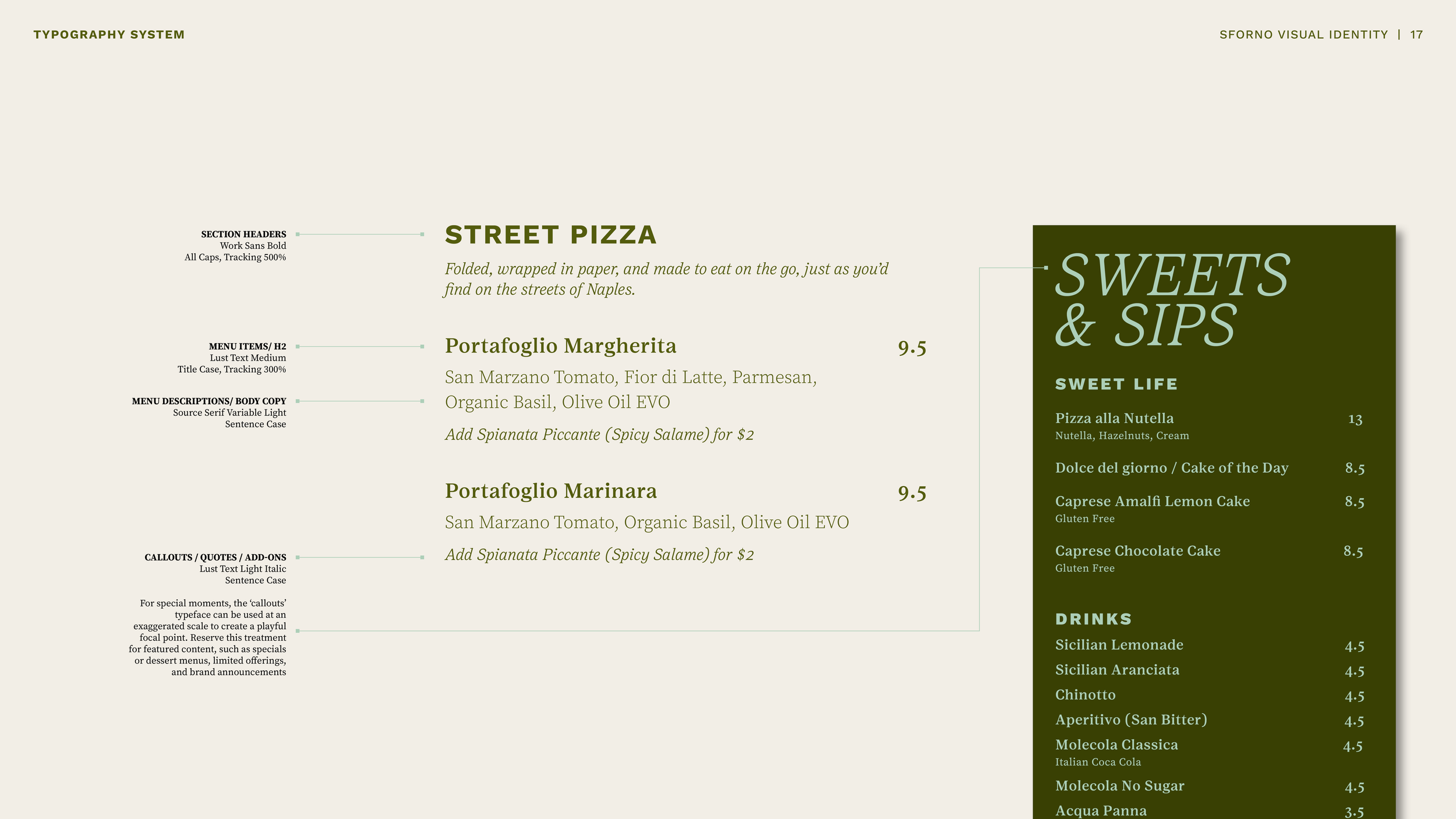
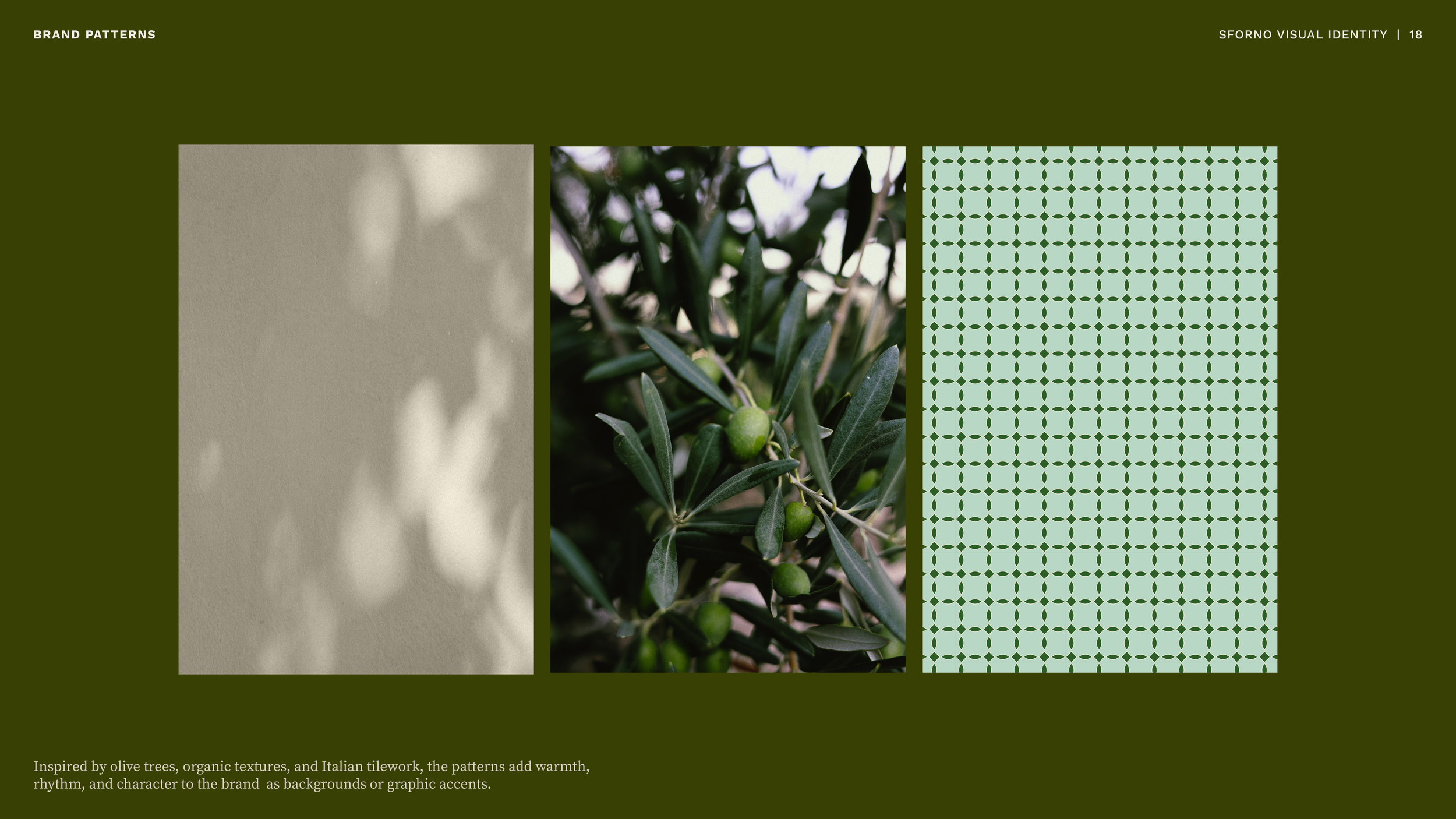
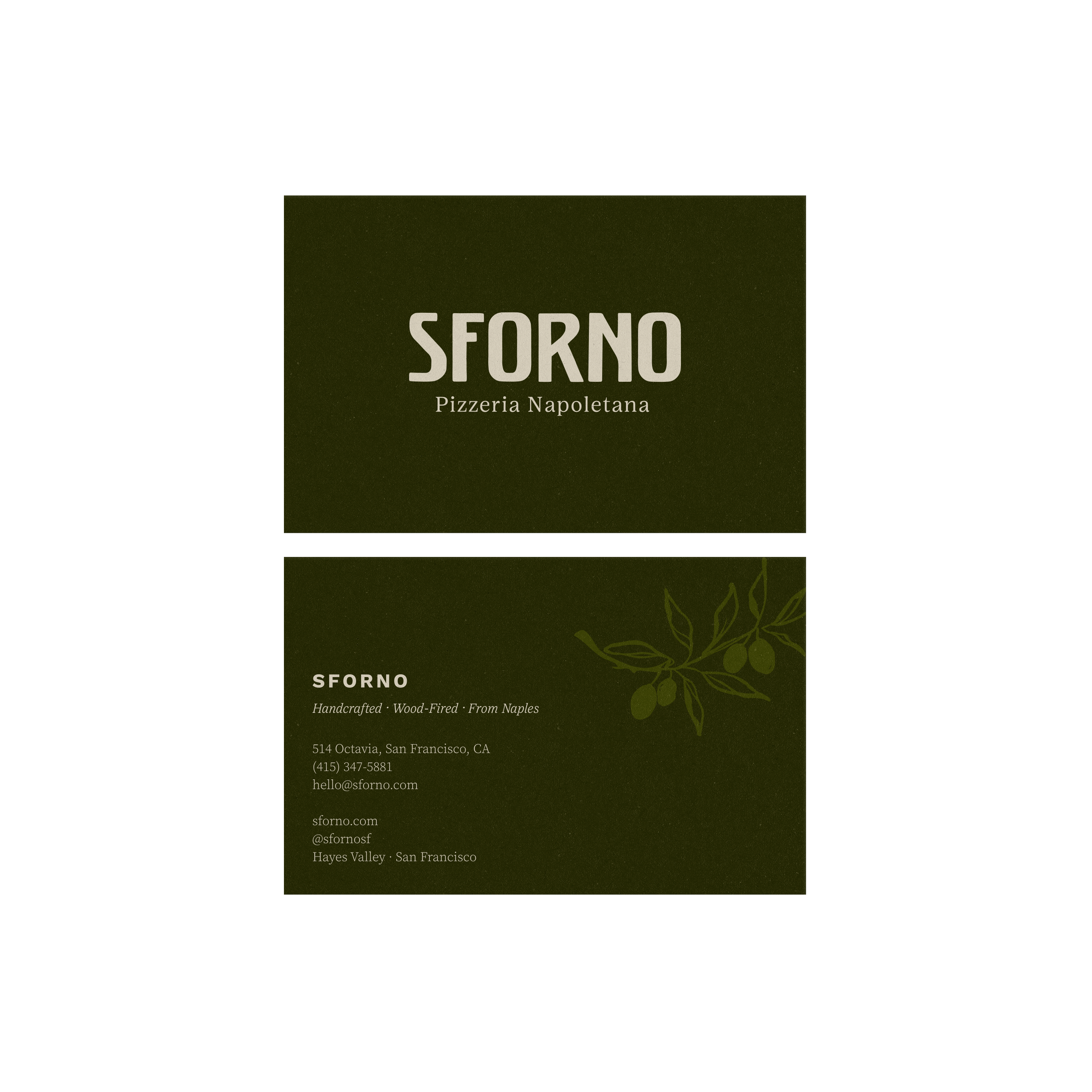
The visual system builds on this sense of place through the character of Italian sign painting and the rhythm of traditional tilework. A bold, handcrafted wordmark is balanced by elegant serif typography, expressive illustrations, and thoughtful patterns.
Together, these elements create an identity that feels distinctly Italian without relying on convention, refined yet approachable, systematic and yet full of Italian personality.









BRAND WORLD