
The Empowered family COllective
REBRAND & NEW LOGO
2024, 3 Weeks
Challenge:
The Empowered Family Collective needed a full rebrand to better align with their mission and connect more effectively with their community. Their existing visual identity lacked cohesion, modernity, and emotional resonance.
Role:
As the lead (and sole) designer, I was responsible for conceptualizing, building, and executing a new brand system. I partnered closely with the CEO to ensure that the brand's new look authentically reflected their values and vision.
Impact:
The rebrand created a unified, professional, and emotionally engaging visual presence across all platforms. It strengthened the organization's identity, built greater recognition, and provided a flexible, scalable system for future growth.
Deliverables:
Redesigned logo
New brand color palette
Updated brand typography system
Visual identity guidelines
Brand assets applied across web, social media, and print collateral
Skills:
Branding and visual identity development
Logo design
Typography systems
Color theory and palette development
Client collaboration and stakeholder communication
Tools:
Adobe Illustrator
Adobe Photoshop
Understanding the Motivation for a Rebrand:
The client sought to develop a more cohesive and clearly defined brand identity, with the ultimate goal of strengthening their presence within their industry and community.
Specifically, they aimed to modernize their brand, creating a more sophisticated and contemporary brand experience.
Aligning with the EFC Mission:
The EFC mission begins with a deep rooted commitment to community, maintained by pathways of resilience, uplifting support, and belonging.
When starting to ideate a new logo, new colors, typography, and other visual aesthetics for this rebrand, I wanted to modify with a simple and clean modernity that communicated persistent strength and support. I worked to both ensure a subtle continuity with the original brand and find alignment with its new mission, motivations, and communication objectives.

Continuity vs. Modification:
Continuity is one of the most important components to successful branding. So, the client and I discussed specifics.
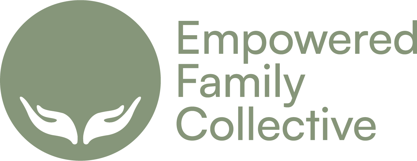
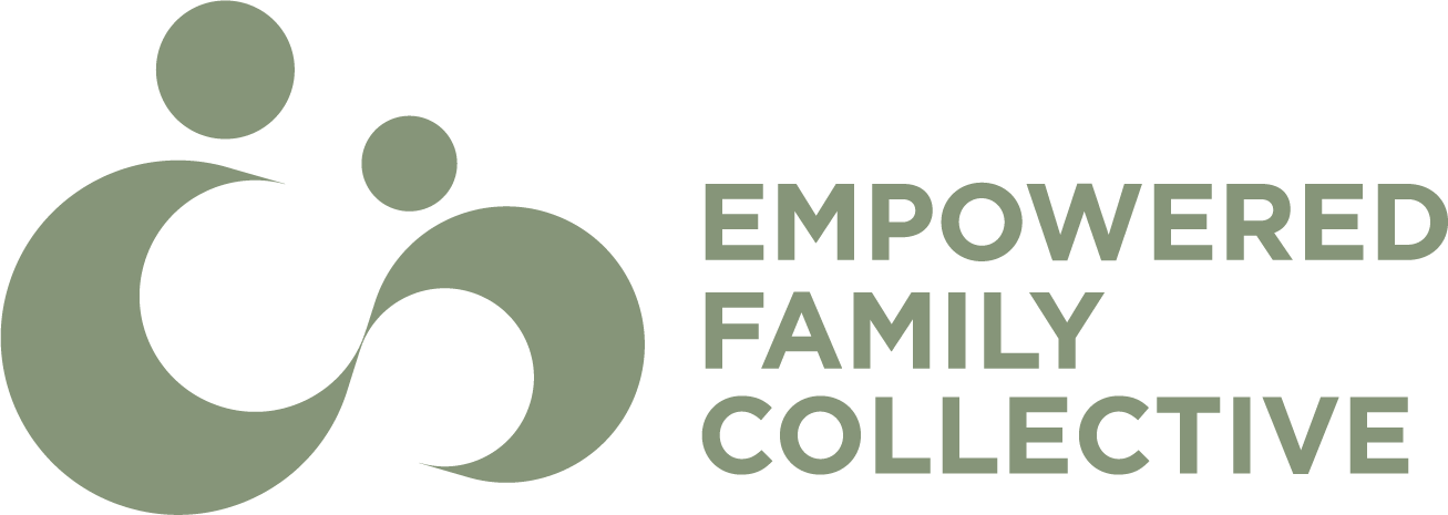
While the values of the Empowered Family Collective include strength, support, and other robust and resilient qualities, the client wished to maintain a calmness and ‘flow' represented in the original logo. More specifically, of the old logo she liked the muted calmness of the green color, the visual of two individuals in connection, and the hand 'offering support.
OLD:
UPDATED:

Initial Design Process
Initial ConceptS


Second Round Concepts


Chosen LOGO Direction +
Color Studies:


NEW BRAND SUMMARY
The following is a brief summary of the new brand design assets, defining the desired deliverables. It is not the full brand-guidelines, but was made to offer the client a quick glance overview of the brands essential assets.

Moving forward..

The following designs are prospective ideations of the brand in use. More specifically, how the brand might show up on a website and within a business system.

